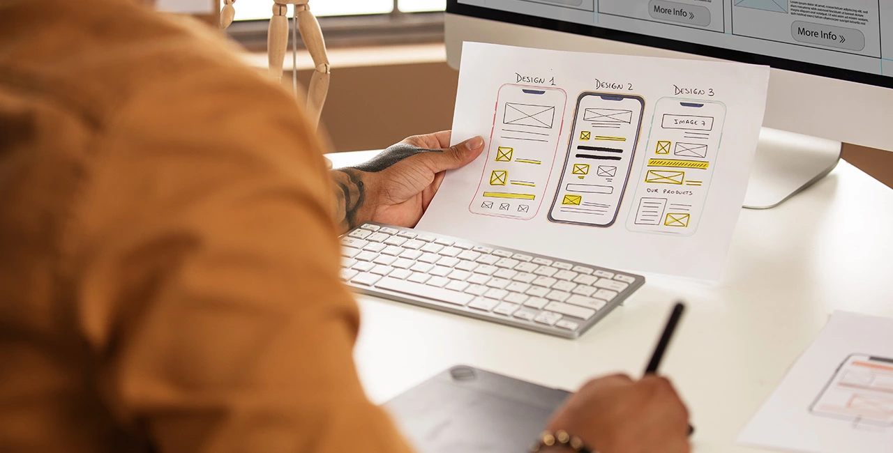
Designing a mobile-friendly website is crucial in today’s digital landscape, as more and more people access the internet through their mobile devices. Here are some tips on how to design a mobile-friendly website:
- Choose a responsive design: A responsive design automatically adjusts the layout of your website to fit the screen size of the device being used. This ensures that your website looks great on any device, whether it’s a smartphone, tablet, or desktop computer.
- Keep it simple: Mobile devices have smaller screens, so it’s important to keep your design simple and clutter-free. Use a minimalistic design that focuses on the most important information and content.
- Use large fonts: Small fonts can be difficult to read on mobile devices, so make sure to use large, legible fonts that are easy to read on a smaller screen.
- Optimize images: Large images can slow down your website’s load time, which can be frustrating for users on a mobile device. Make sure to optimize your images for mobile devices by compressing them and reducing their file size.
- Use mobile-friendly navigation: Navigation is critical to a website’s usability, especially on mobile devices. Use a simple, easy-to-use navigation menu that’s optimized for touch screens.
- Test on multiple devices: Make sure to test your website on multiple devices to ensure that it looks great and functions properly on all screen sizes.
In terms of finding a designer in Jaipur, Rajasthan, India, you can search for “Design Prefect” a best web design agency online. Look for portfolios and reviews to find a designer that has experience designing mobile-friendly websites and has a design aesthetic that matches your vision.
